Skip to content

00 · Local businesses

Sites forlocal businesses,built with care.

Restaurants, workshops, professional practices, retail, B2B services. You talk to one person from the first message to launch, and prices are written on the page (no quote-by-email for the entry tiers).

Bucharest, RO

Available for new projects

01 · Projects

Three design studies for local businesses.

A neighbourhood diner with character, a cultural project for a Bucharest Japanese garden, a specialty cafe on Lipscani. Three studies built as serious design and implementation exercises, not delivered projects.

Demonstration project

01 / 03

Bucky's Diner

Scope
Brand site, menu, reservations, feedback
City
București
Year
2026

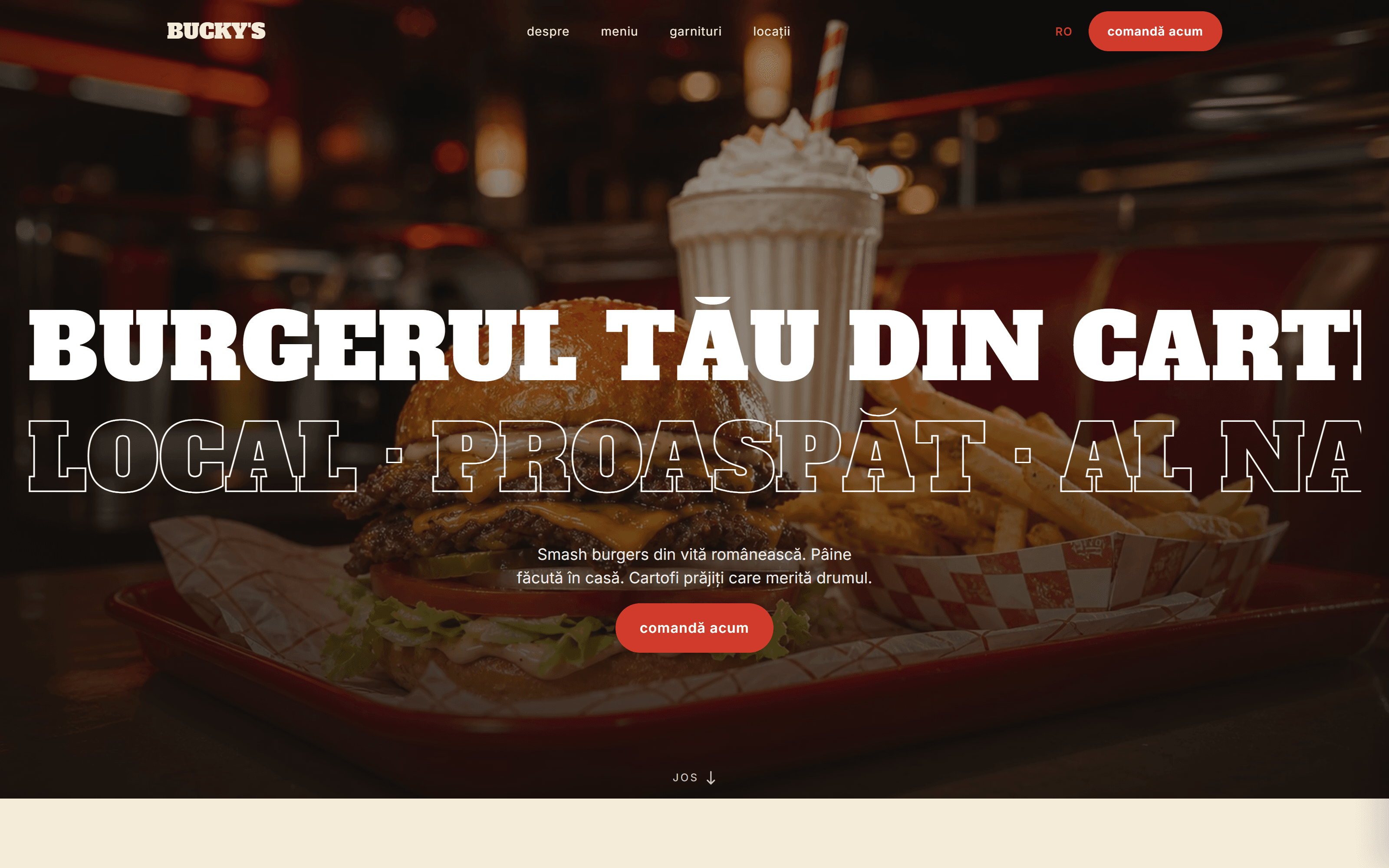
An American-Romanian neighbourhood diner with a voice of its own. The site mixes food photography with billboard-scale display type; hand-drawn sticker badges and a mustard / peach / teal palette separate it from any fast-casual template.

Visit live site(opens in a new tab)
Bucky's Diner
Bucky's Diner, Brand site, menu, reservations, feedback
Project detail5 frames
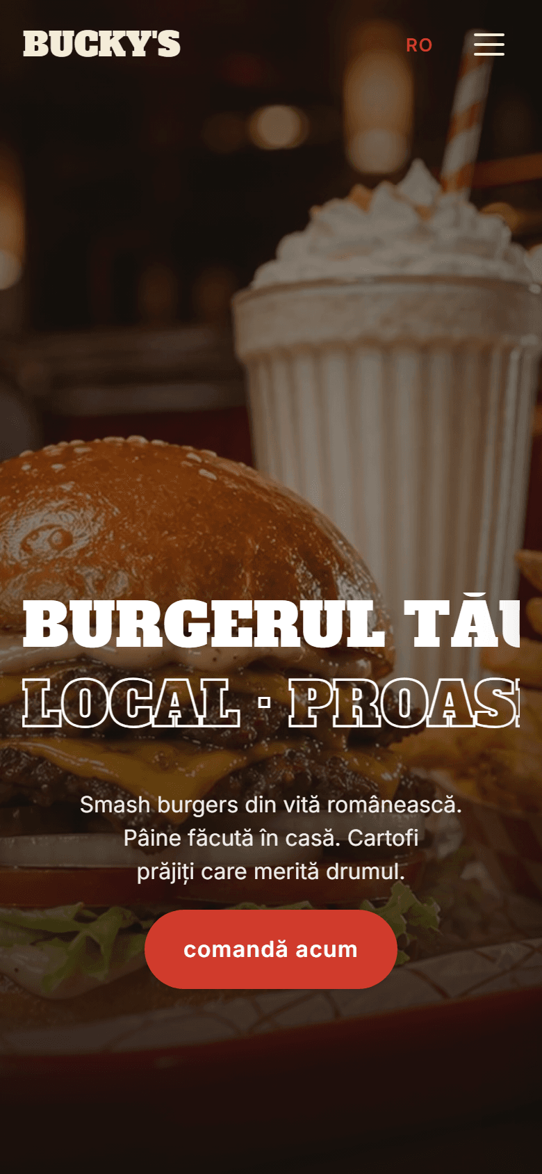
Mobile hero. The marquee fills edge-to-edge, the hamburger replaces nav, the subtitle reflows. The typographic weight against the photograph is just as strong in portrait.
Mobile

Mobile hero. The marquee fills edge-to-edge, the hamburger replaces nav, the subtitle reflows. The typographic weight against the photograph is just as strong in portrait.

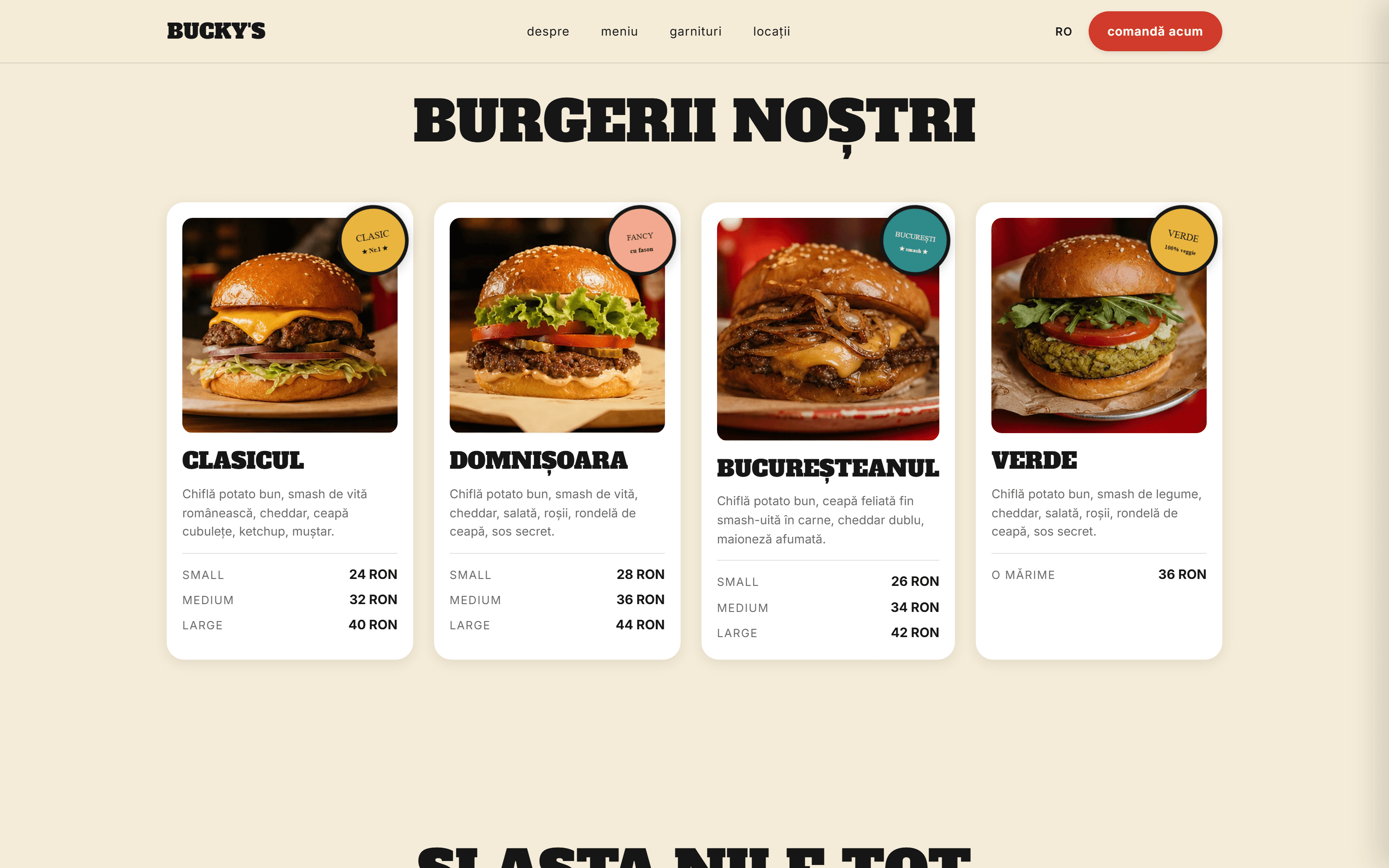
  1. Four burger cards on cream: food photo, hand-drawn sticker badge (CLASIC ★, FANCY cu fason), and a SMALL / MEDIUM / LARGE price table. The detail that gives the page its character.
    Desktop · 01 / 04

    Four burger cards on cream: food photo, hand-drawn sticker badge (CLASIC ★, FANCY cu fason), and a SMALL / MEDIUM / LARGE price table. The detail that gives the page its character.

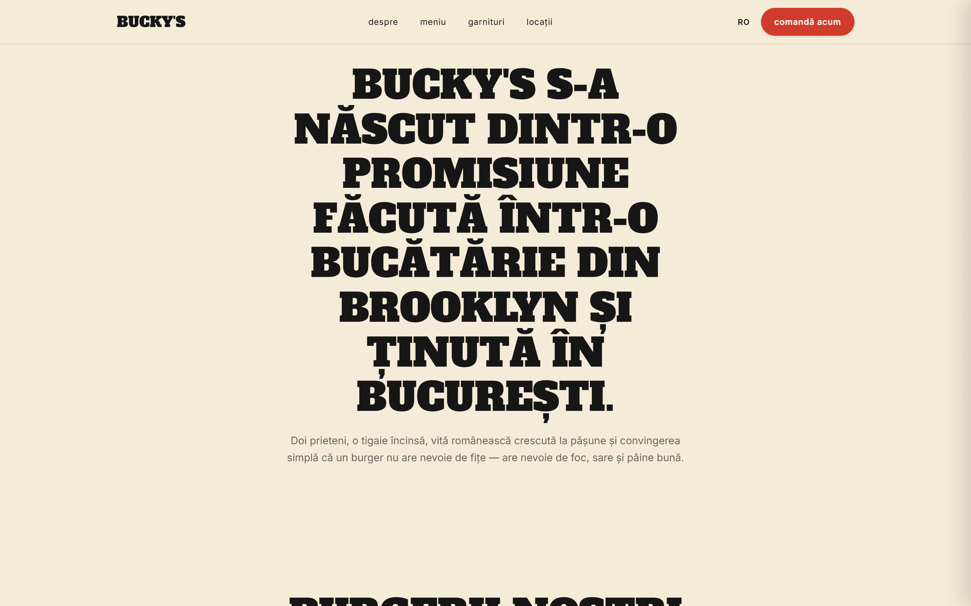
  2. A single display headline at cover scale ('BUCKY'S S-A NĂSCUT DINTR-O PROMISIUNE…'), tight uppercase on cream, with one restrained paragraph below. Typography carries the page on its own, no imagery needed.
    Desktop · 02 / 04

    A single display headline at cover scale ('BUCKY'S S-A NĂSCUT DINTR-O PROMISIUNE…'), tight uppercase on cream, with one restrained paragraph below. Typography carries the page on its own, no imagery needed.

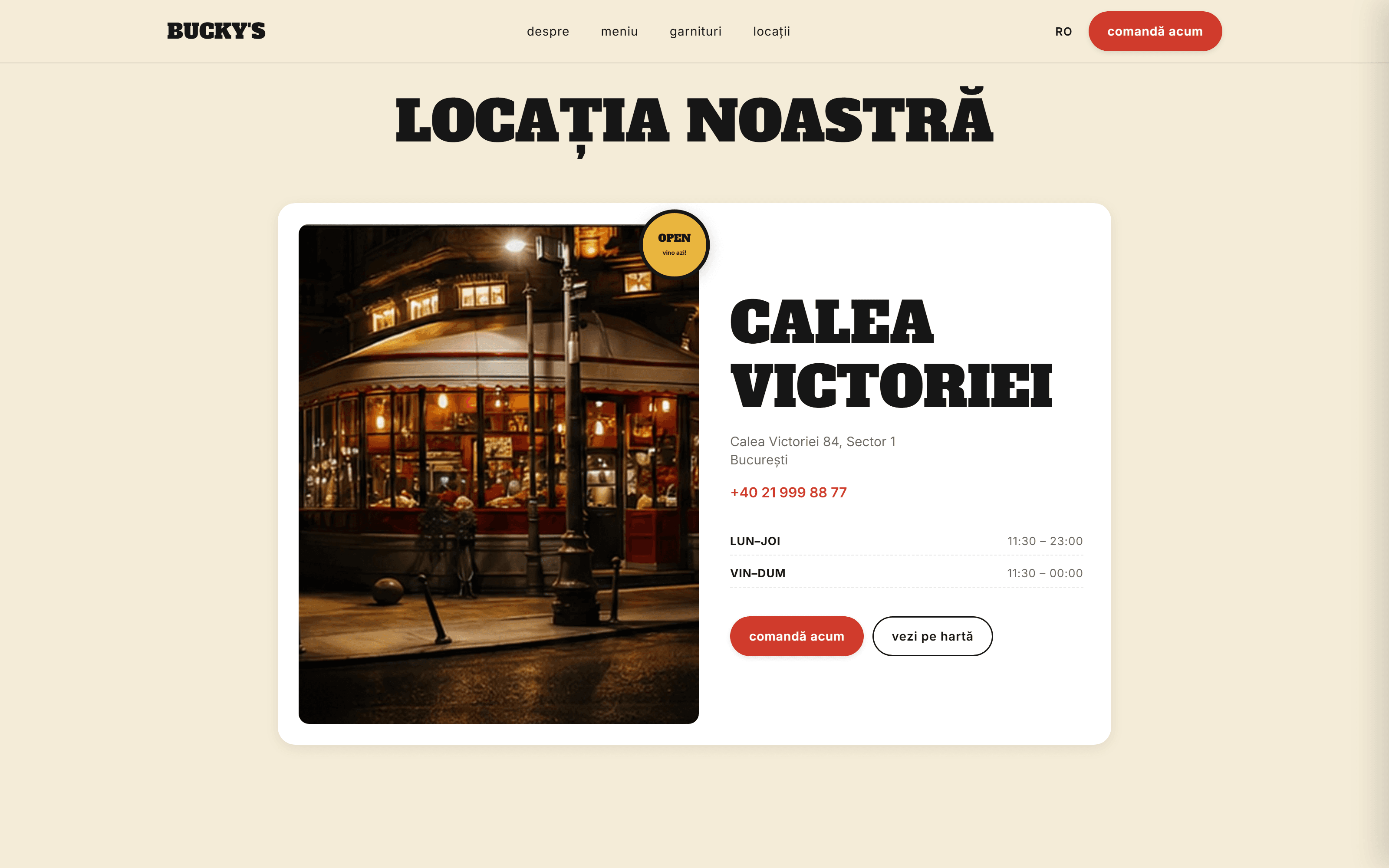
  3. Evening photograph of the Calea Victoriei storefront paired with a structured info block: serif location name, address, hours, dual CTAs, and a slow-rotating OPEN sticker.
    Desktop · 03 / 04

    Evening photograph of the Calea Victoriei storefront paired with a structured info block: serif location name, address, hours, dual CTAs, and a slow-rotating OPEN sticker.

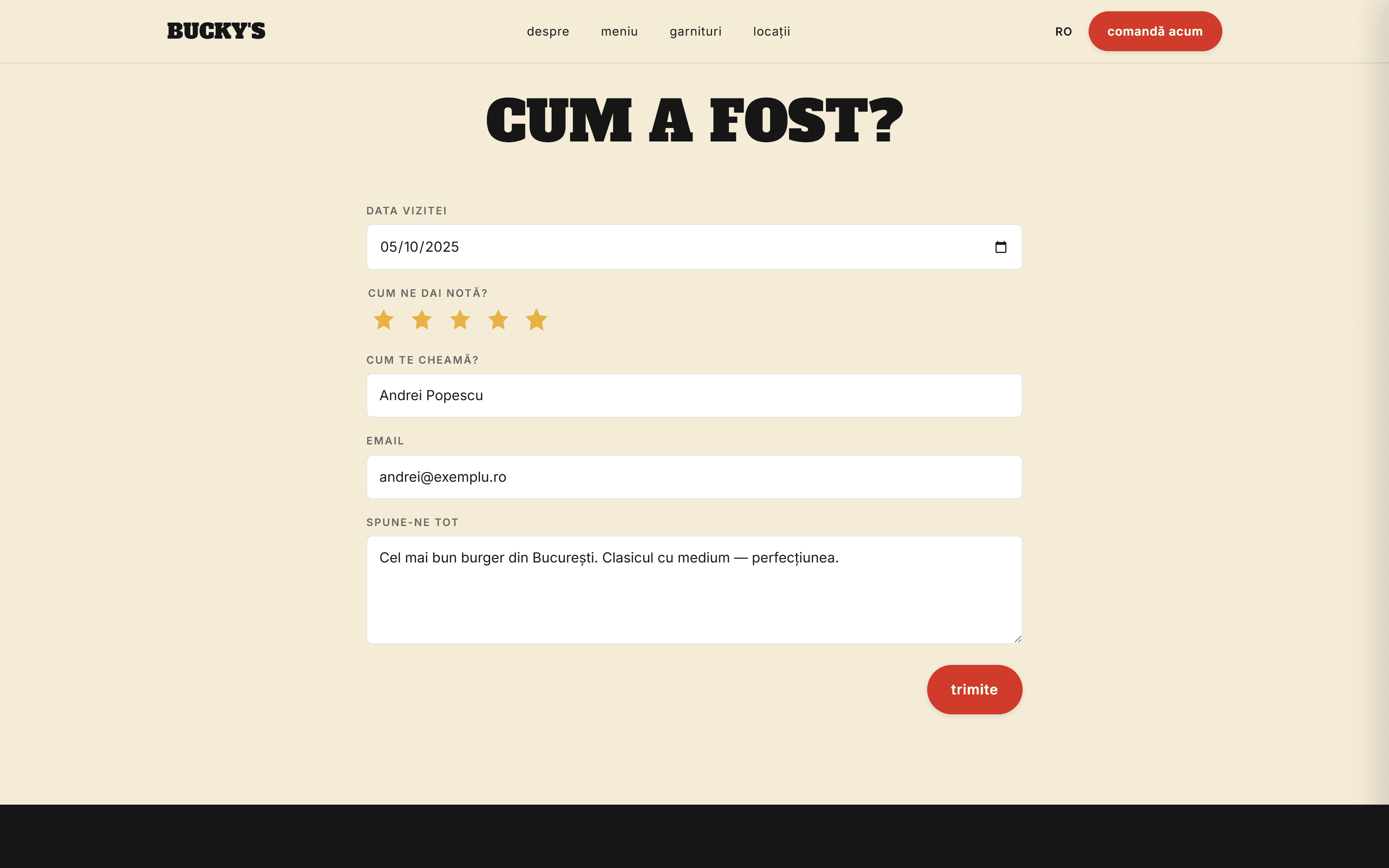
  4. The 'Cum a fost?' feedback form with every field filled and five gold stars active. The interactive component shown with real data and the primary red CTA in the foreground.
    Desktop · 04 / 04

    The 'Cum a fost?' feedback form with every field filled and five gold stars active. The interactive component shown with real data and the primary red CTA in the foreground.
Demonstration project

02 / 03

Grădina Japoneză București

Scope
Cultural project site, masterplan, architecture
City
București
Year
2026

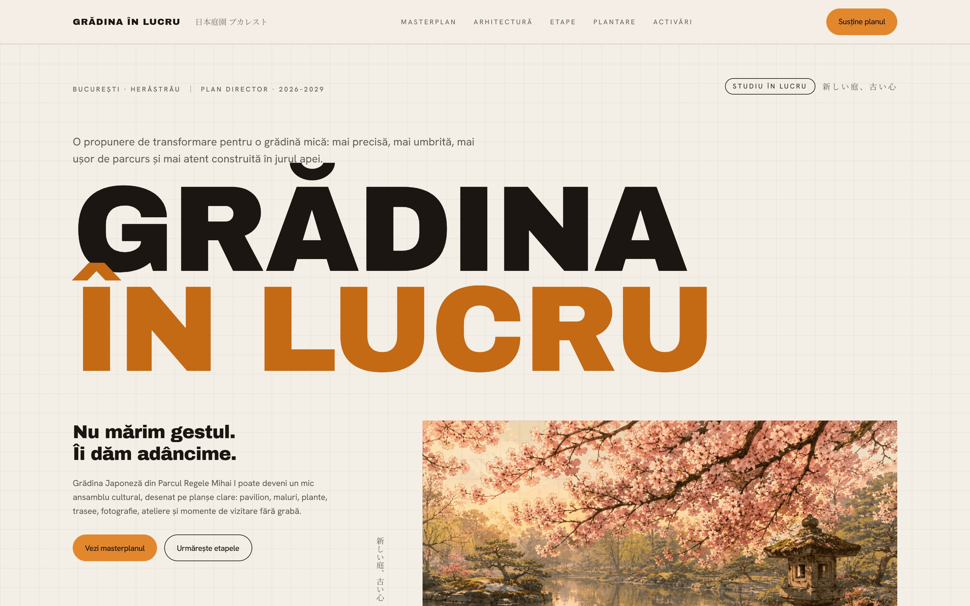
A site for a cultural project: a Japanese garden conceived for a Bucharest neighbourhood. Archivo Black display at ~12.6vw, a cream-paper-and-ink palette with amber as signal, and a kanji notation that threads the sections. Reads like an architecture monograph, not an event page.

Visit live site(opens in a new tab)
Grădina Japoneză București
Grădina Japoneză București, Cultural project site, masterplan, architecture
Project detail5 frames
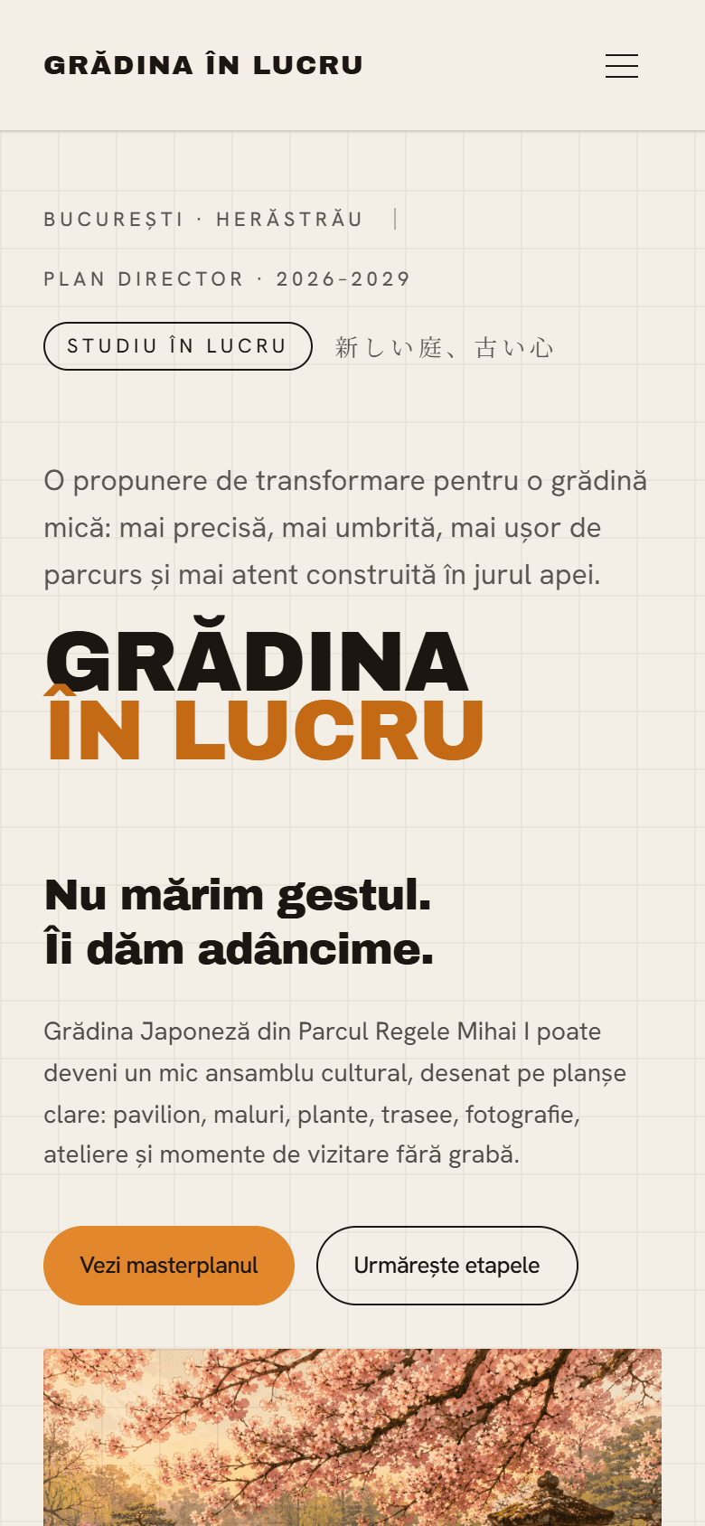
Mobile hero. The display headline collapses gracefully to ~12vw fluid, the 'STUDIU ÎN LUCRU' pill stays legible, and the two-button CTA stack is thumb-accessible.

Mobile

Mobile hero. The display headline collapses gracefully to ~12vw fluid, the 'STUDIU ÎN LUCRU' pill stays legible, and the two-button CTA stack is thumb-accessible.

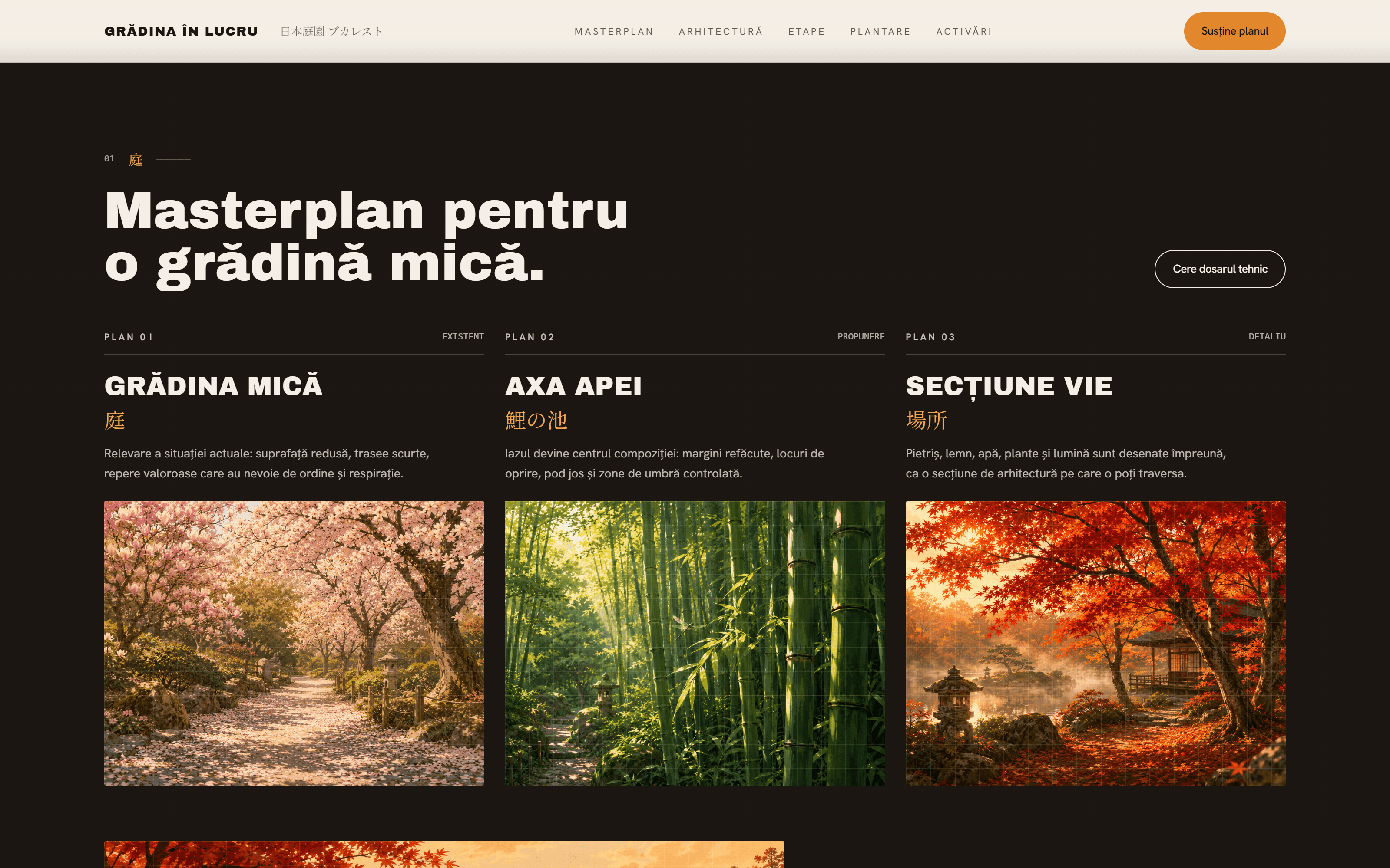
  1. The warmest dark section on the site: near-black ink, blueprint grid, three plan-sheet cards side by side (cherry blossom, bamboo, autumn), each anchored by an amber kanji. The visual centre of the page.

    Desktop · 01 / 04

    The warmest dark section on the site: near-black ink, blueprint grid, three plan-sheet cards side by side (cherry blossom, bamboo, autumn), each anchored by an amber kanji. The visual centre of the page.

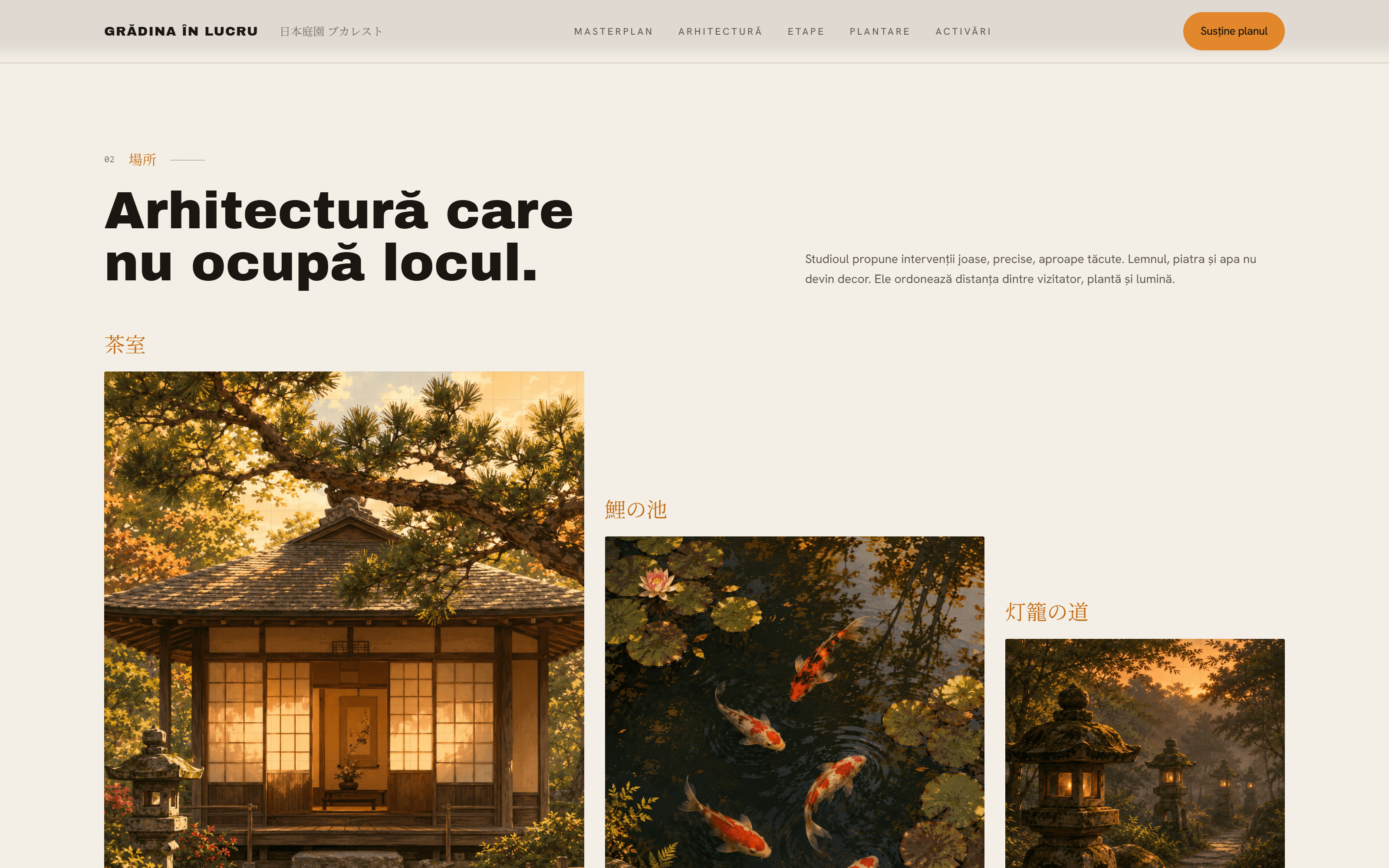
  2. Three images at deliberately mismatched aspect ratios (a tall Tea House, a medium Koi Pond, a narrow Lantern Path), bottom-aligned so their tops stagger like a skyline.

    Desktop · 02 / 04

    Three images at deliberately mismatched aspect ratios (a tall Tea House, a medium Koi Pond, a narrow Lantern Path), bottom-aligned so their tops stagger like a skyline.

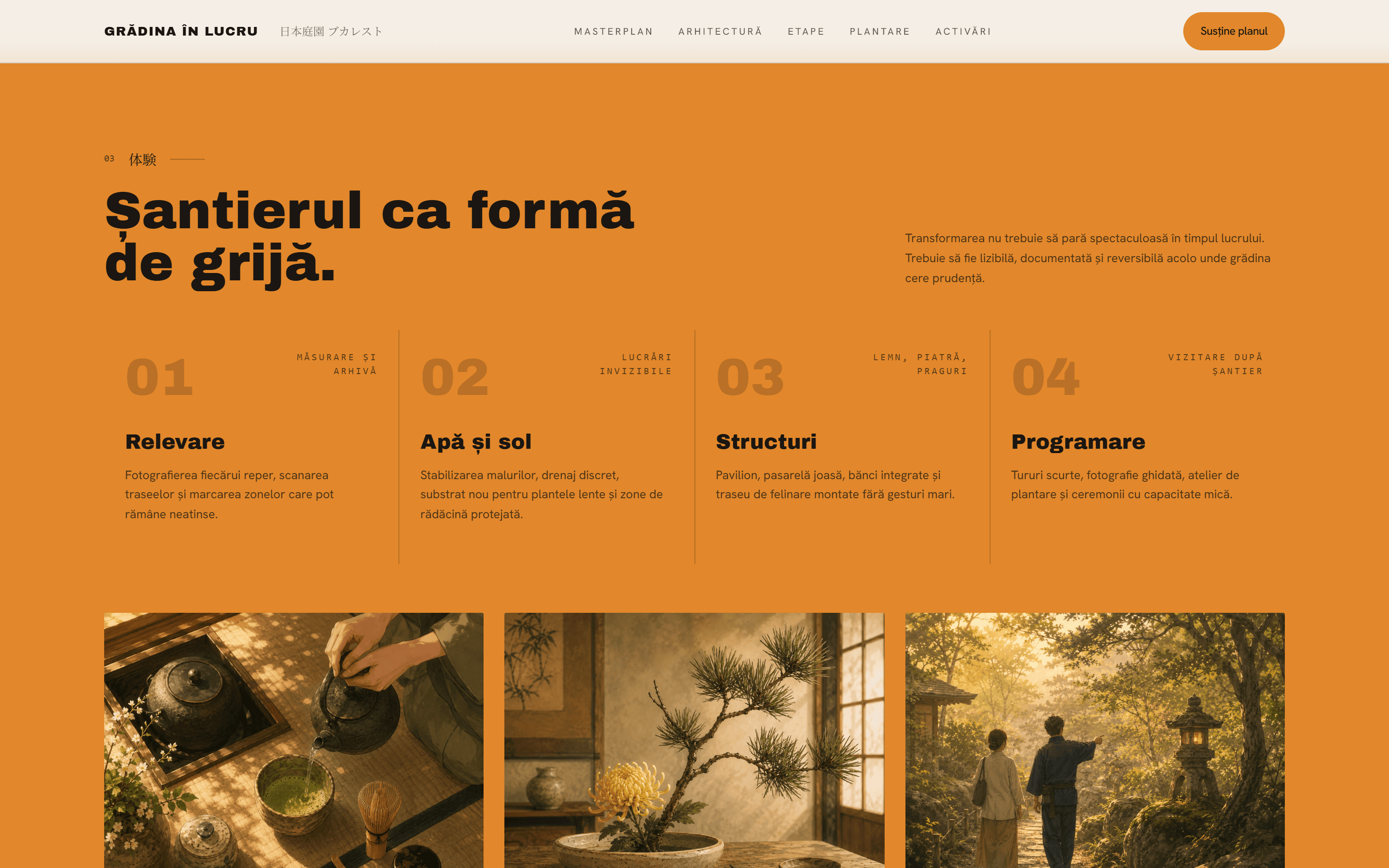
  3. The amber section. A four-phase construction grid (01 Relevare → 04 Programare); the monochrome numerals at 6xl set at 20% opacity create a typographic watermark that conveys sequence without shouting.

    Desktop · 03 / 04

    The amber section. A four-phase construction grid (01 Relevare → 04 Programare); the monochrome numerals at 6xl set at 20% opacity create a typographic watermark that conveys sequence without shouting.

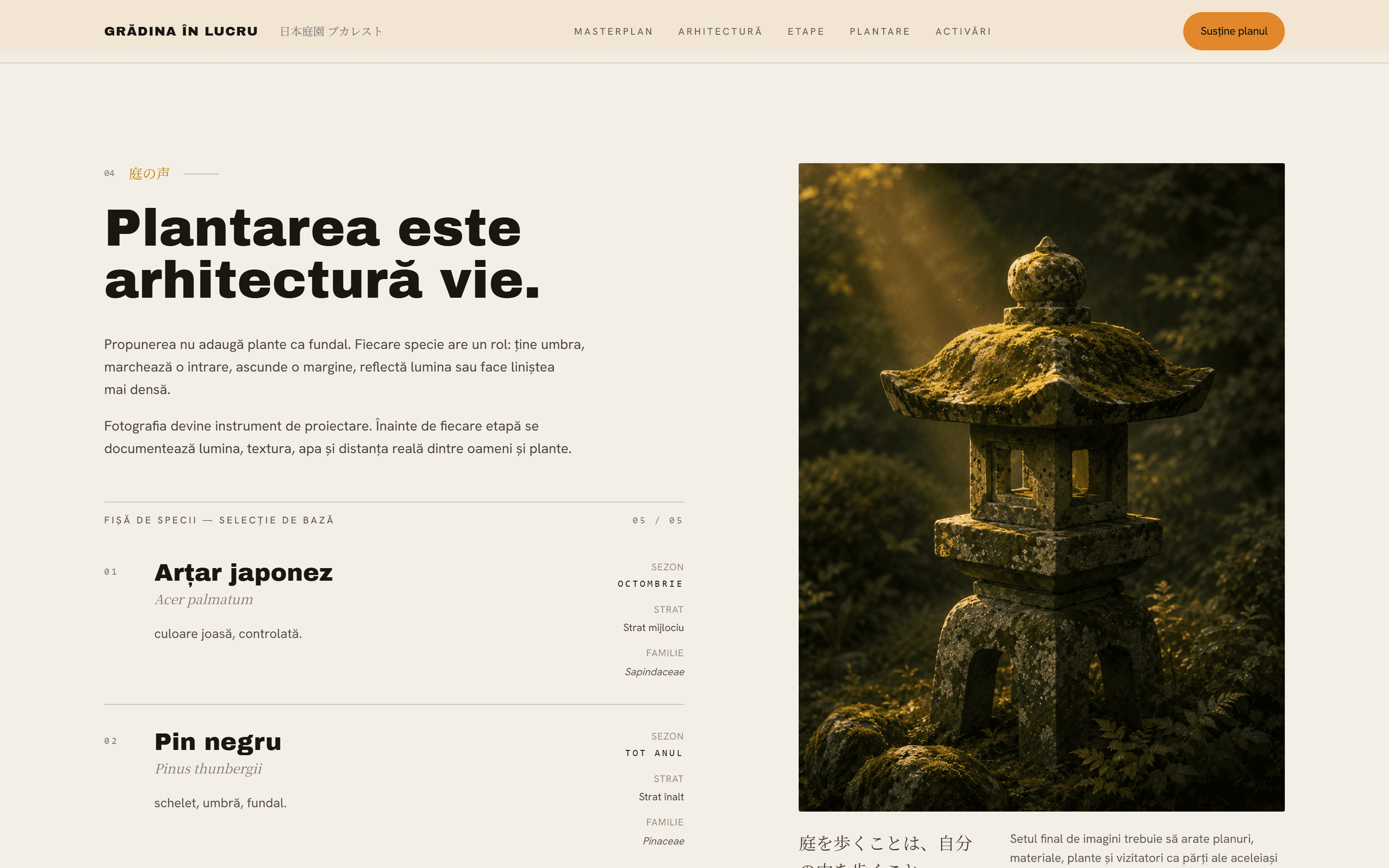
  4. Two columns: the opening manifesto and the start of the plant-palette table (Arțar japonez / Acer palmatum, Pin negru / Pinus thunbergii), paired with a moody studio photograph of a moss-covered stone lantern.

    Desktop · 04 / 04

    Two columns: the opening manifesto and the start of the plant-palette table (Arțar japonez / Acer palmatum, Pin negru / Pinus thunbergii), paired with a moody studio photograph of a moss-covered stone lantern.

Demonstration project

03 / 03

Sămânță Specialty Cafe

Scope
Brand site, menu, events, reservations, map
City
București
Year
2026

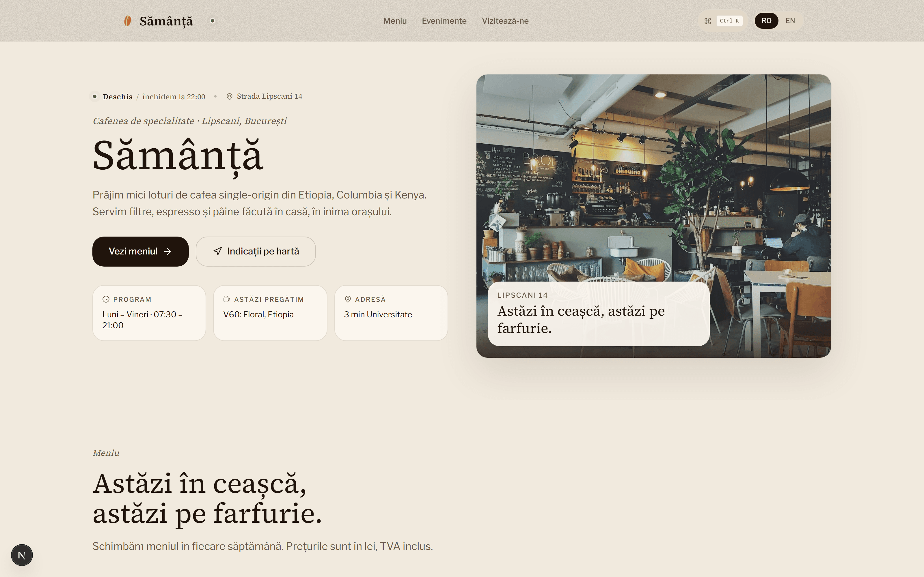
A specialty cafe at Lipscani 14, written like a publication. An editorial hero with the Sămânță logotype over a warm cafe photograph, a hand-drawn map with a pulsing pin, and a reservation form built with attention to every state.

Visit live site(opens in a new tab)
Sămânță Specialty Cafe
Sămânță Specialty Cafe, Brand site, menu, events, reservations, map
Project detail5 frames
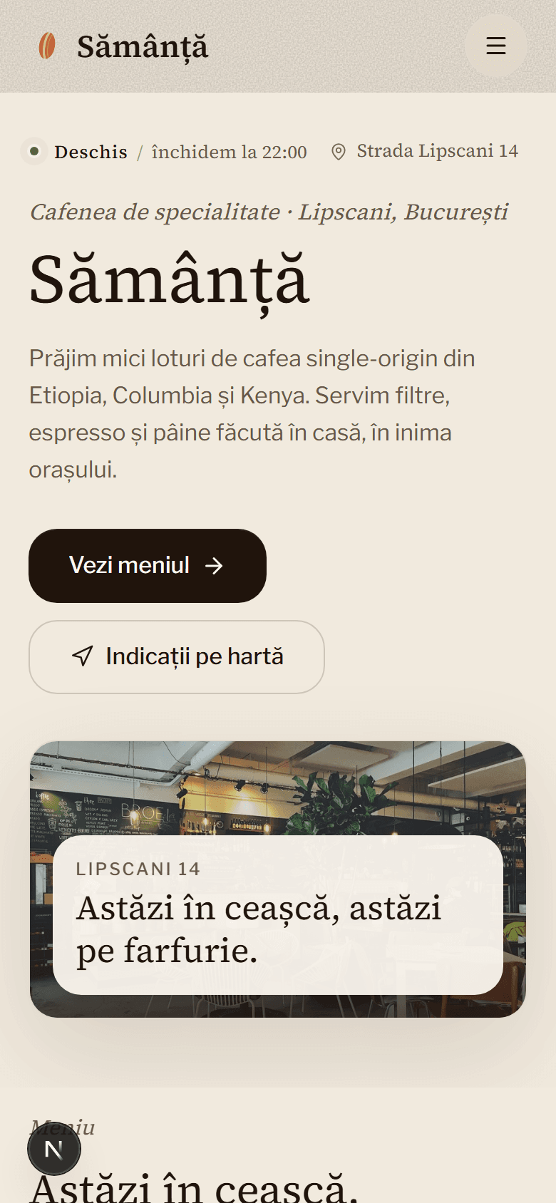
Mobile hero. The photo stacks below the copy and fills the width; filter pills, nav drawer icon and status pill are composed for one-thumb use. Nothing overflows.

Mobile

Mobile hero. The photo stacks below the copy and fills the width; filter pills, nav drawer icon and status pill are composed for one-thumb use. Nothing overflows.

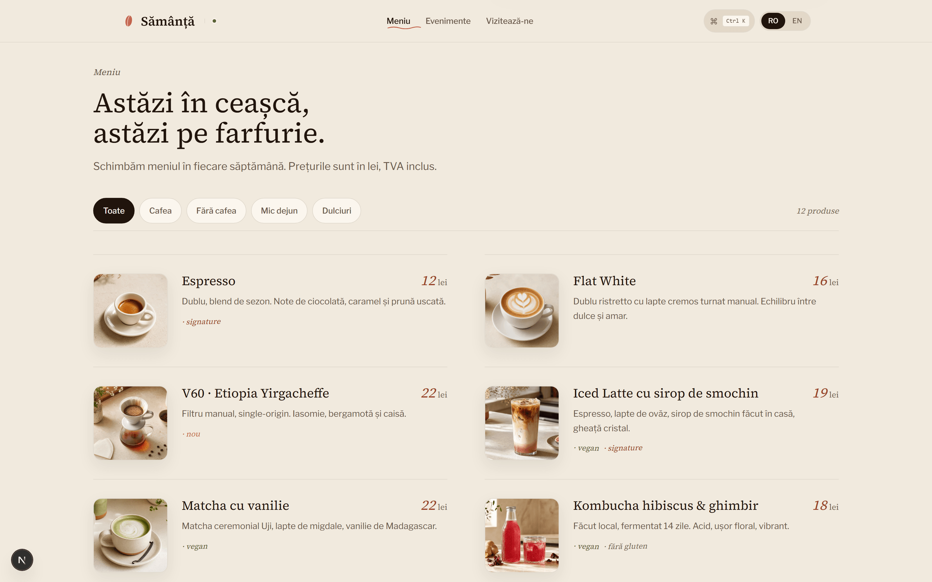
  1. The full menu with 'Toate' selected: a two-column grid pairing square food photos with italic terracotta prices, muted-ink descriptions, and small rotated tag labels.

    Desktop · 01 / 04

    The full menu with 'Toate' selected: a two-column grid pairing square food photos with italic terracotta prices, muted-ink descriptions, and small rotated tag labels.

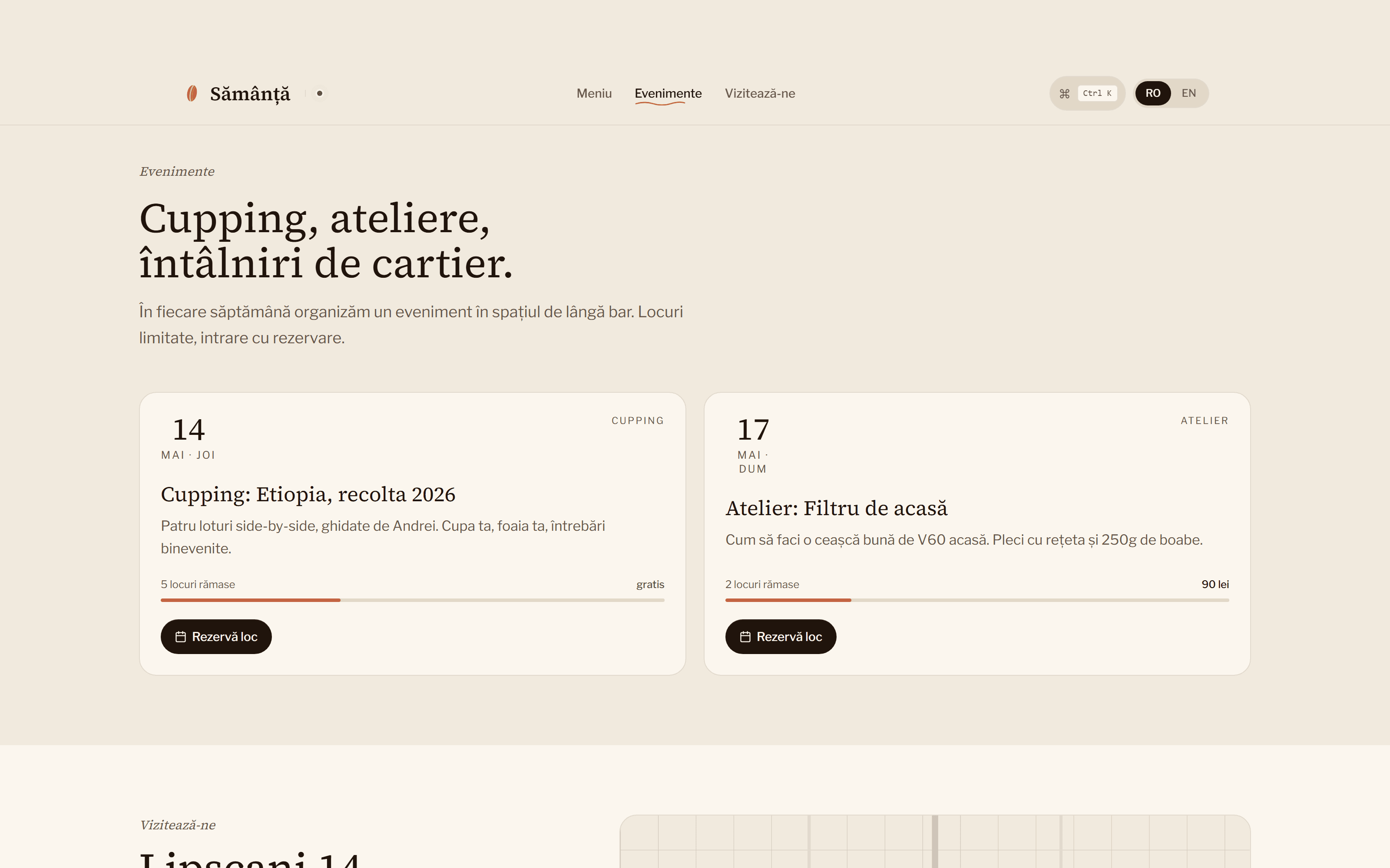
  2. Two event cards with large numeric dates, event-kind labels, seat-availability progress bars, and a 'Rezervă loc' CTA. A quiet UI, with product-grade rigour.

    Desktop · 02 / 04

    Two event cards with large numeric dates, event-kind labels, seat-availability progress bars, and a 'Rezervă loc' CTA. A quiet UI, with product-grade rigour.

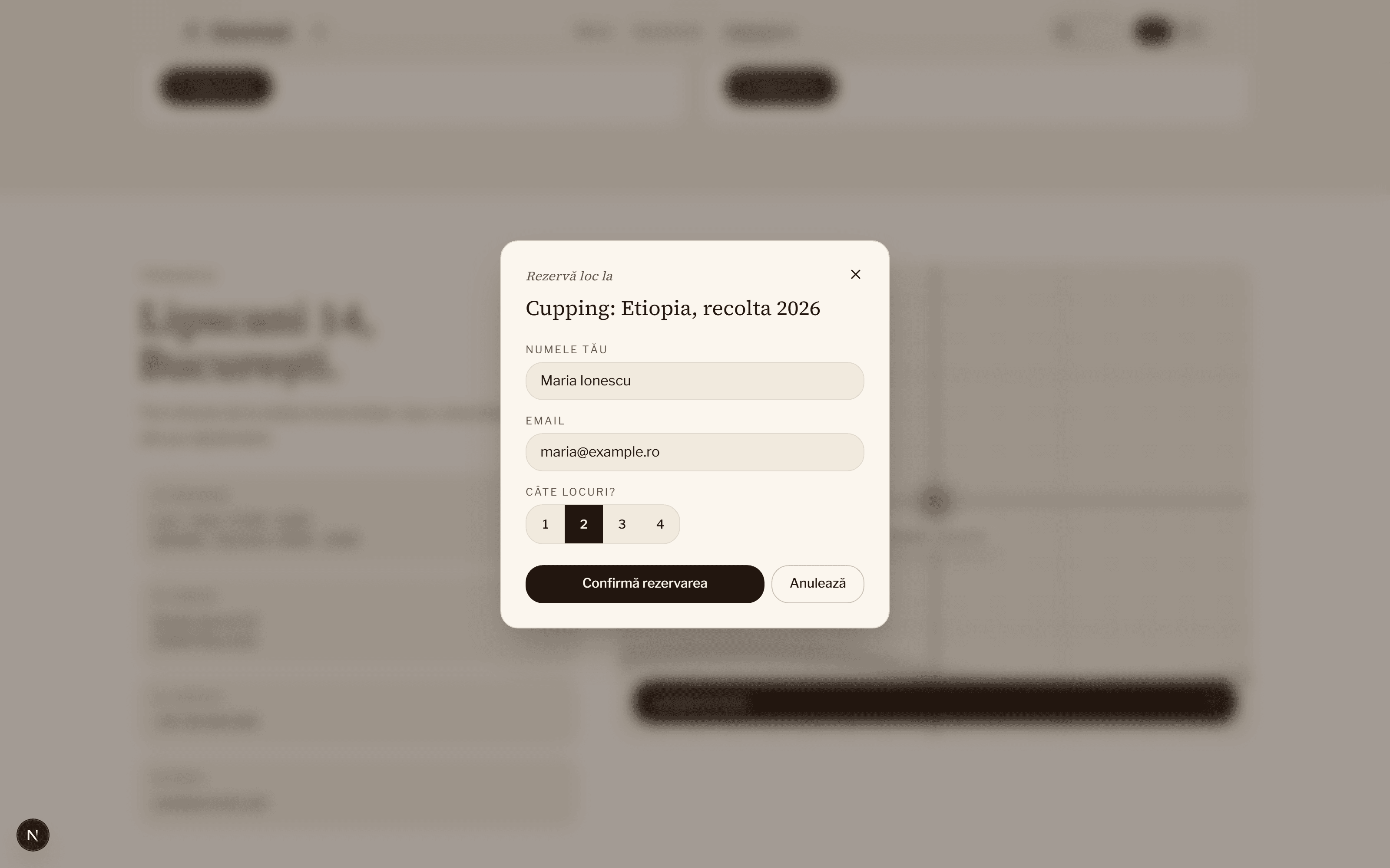
  3. The reservation modal open with real data: 'Maria Ionescu', 2 seats selected via a segmented control. Backdrop blur and primary CTA active, the interactive layer caught mid-use.

    Desktop · 03 / 04

    The reservation modal open with real data: 'Maria Ionescu', 2 seats selected via a segmented control. Backdrop blur and primary CTA active, the interactive layer caught mid-use.

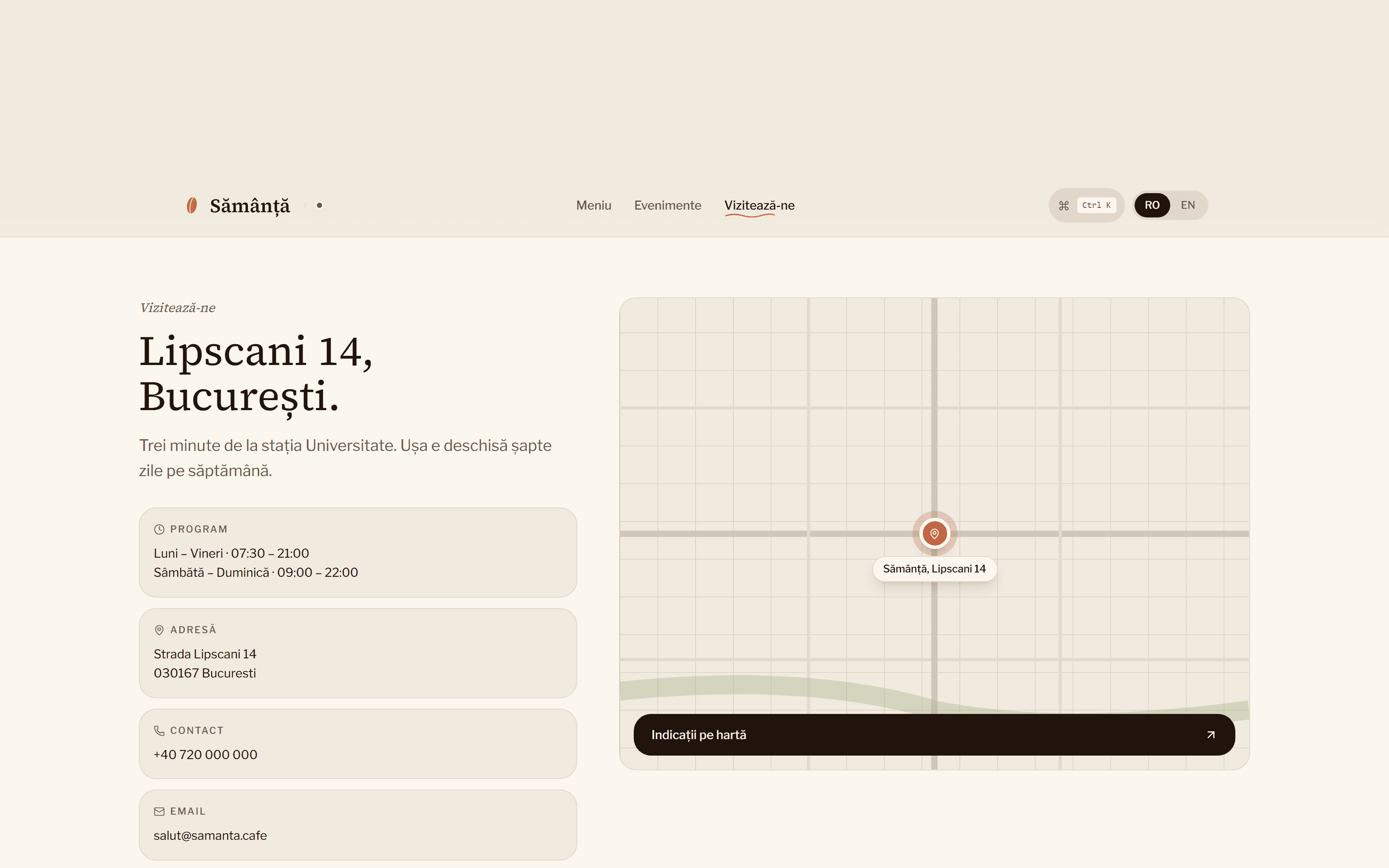
  4. Contact blocks beside a hand-drawn SVG map: grid lines, a topographic curve, a pulsing terracotta pin, a 'Sămânță, Lipscani 14' tooltip. The design element that sets the page apart.

    Desktop · 04 / 04

    Contact blocks beside a hand-drawn SVG map: grid lines, a topographic curve, a pulsing terracotta pin, a 'Sămânță, Lipscani 14' tooltip. The design element that sets the page apart.

02 · How I work

How I work, briefly.

Prices visible before any conversation, one contact throughout, two languages from day one, four-step process.

  1. 01Prices written on the page

    Three tiers, three prices, three delivery times. Read them directly on the page, no quote needed for the entry tiers.

  2. 02One person, from start to finish

    I talk to you, I write the code, I sign the invoice. Replies come directly from the person doing the work, no intermediaries.

  3. 03RO + EN from day one

    The site runs in two languages from launch, not added later. Useful for businesses with international clients or planning to grow abroad.

  4. 04One brief, one design, one site, one invoice

    Brief, design, revisions, launch. Four steps, the same person from the first message to handover.

03 · From here

When you're ready, from here.

Pricing and process are already on the site. If you'd like to talk, write to me.

  1. 01

    See pricing

    Simple, Standard, Custom: price, duration, what's included

  2. 02

    Send me a message

    Email or phone. I usually reply within a few hours